
What the heck am I doing all day?
An experiment in automatic time tracking, and what a whole year looked like as a treemap.

Martin Michaelsen
Oct 1, 2026
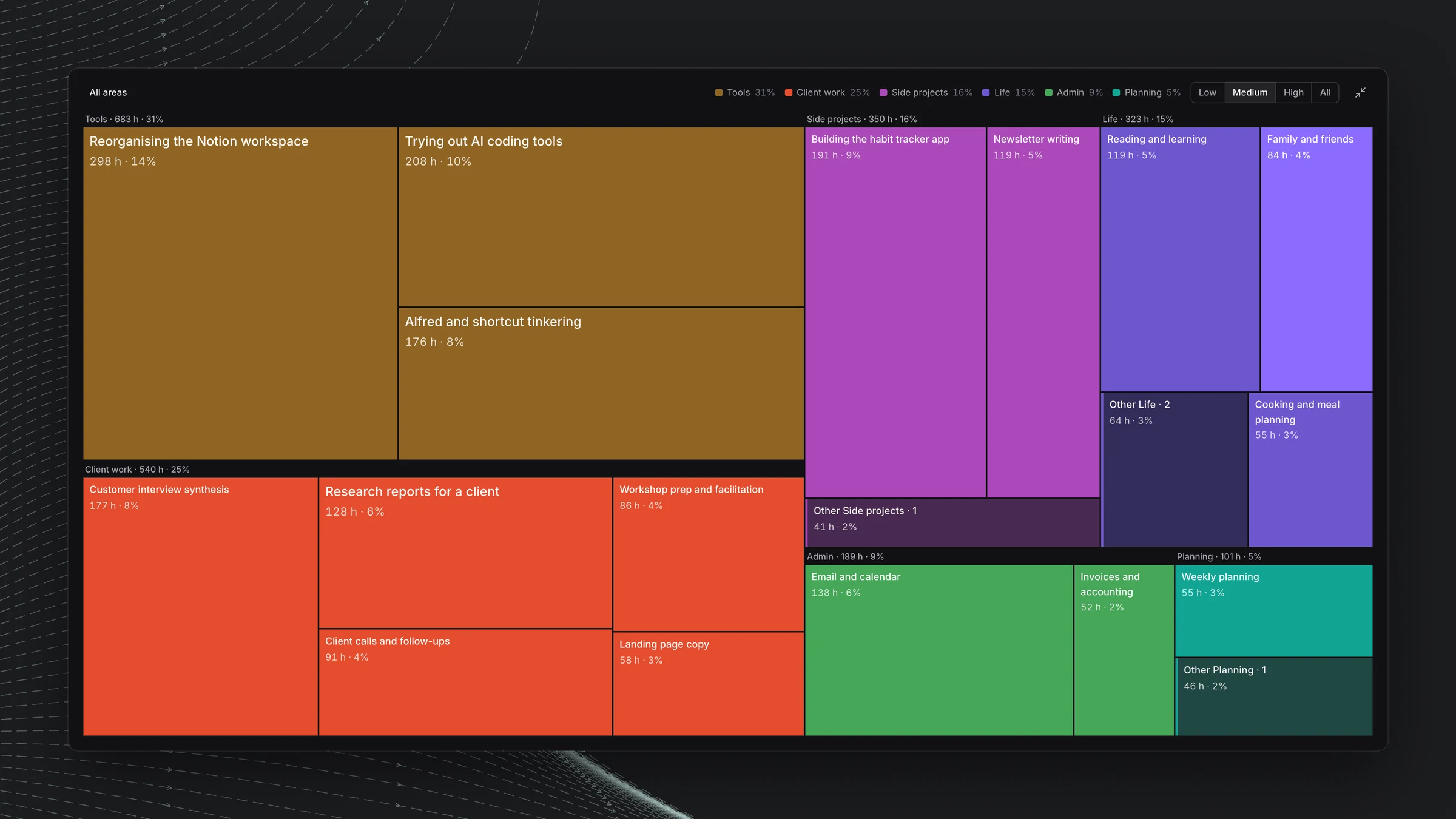
Synthetic data. This is not actually how I spend my time.
I’m obsessed with spending my time wisely, and getting a little older hasn’t made that less important. In the past I tried more extreme time tracking, like tracking every minute of the day. It’s not sustainable, and it’s crazy.
Luckily, now we have great applications that track automatically and come close to giving you a realistic image of how you spend your time. All the data in here comes from an app called Dayflow, which is really nice and really stable. It uses a free Gemini API to classify your tracked hours during the day. That Gemini endpoint is its weak point, but it’s generally working very well.
The challenge is how do you make sense of all that immense data? And there’s a bigger problem, which is that I haven’t really fixed the data at the source. I’ll explain.
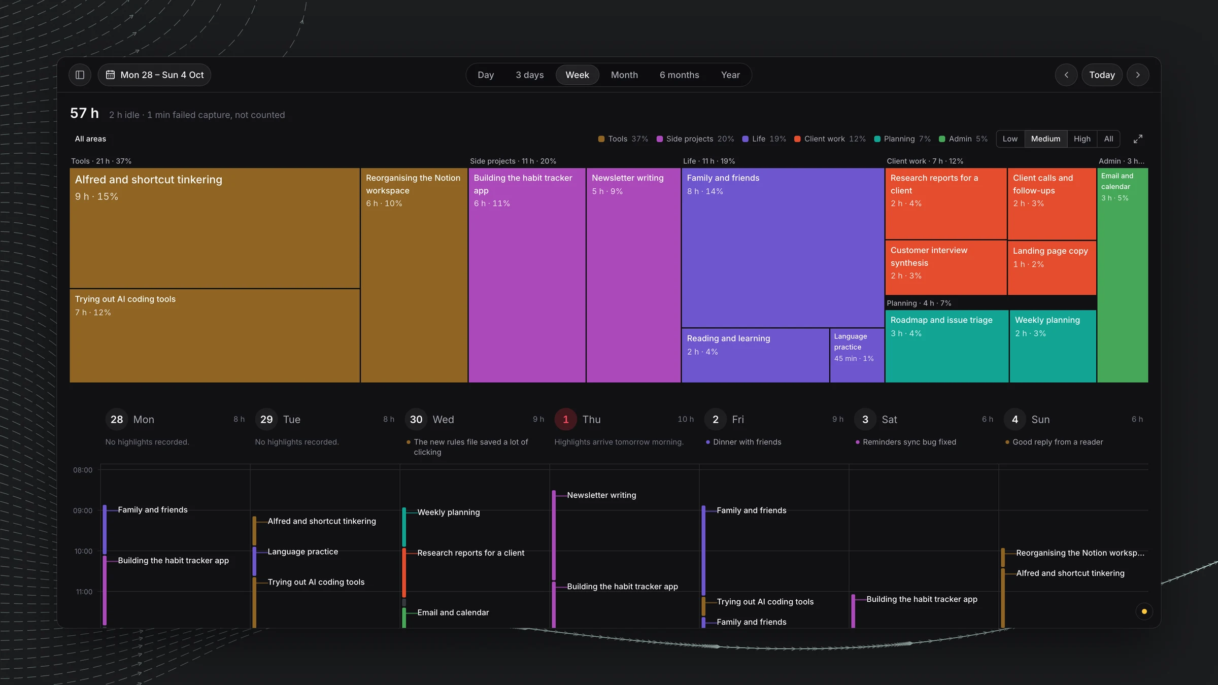
Dayflow’s UI is very opinionated, in a direction of very hip and modern.
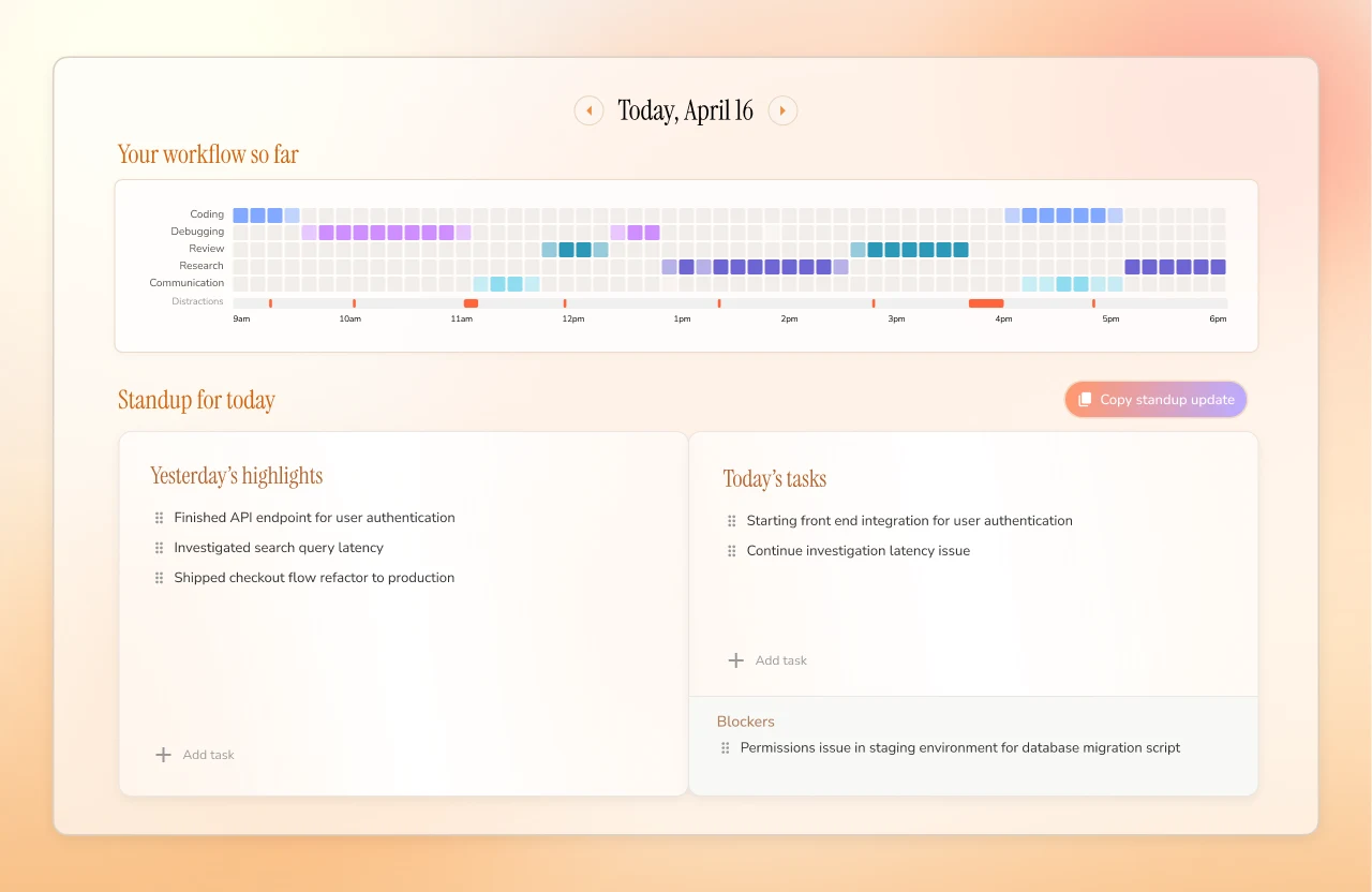
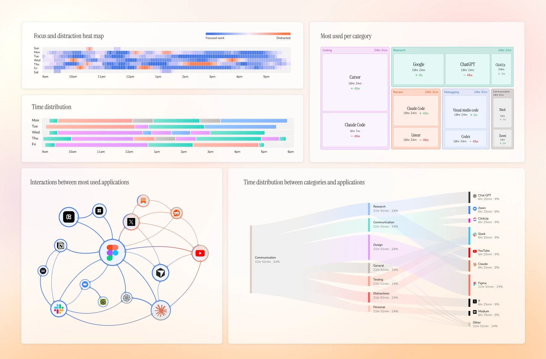
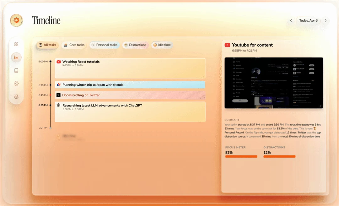
It’s awesome that they’re opinionated. It’s just not for me. This isn’t a knock on Dayflow. There’s not a lot of room to change how you want to display your data. It does have a treemap, but it wasn’t the one I wanted. There’s no dark mode either, and you can’t really drill into the data.
But it’s an excellent way for me to get the beginning data, so I can explore what the heck am I doing all day? Why am I so freaking busy? What are my priorities, now that I understand what I’m doing?
The year
When I first saw a week in a treemap, that wasn’t really the big deal. The big deal was seeing the year in a treemap. Single items that I didn’t regard as very important, and that I hadn’t thought I spent the most time on, were the biggest blocks. My jaw dropped. I spent that much time on this one project? It doesn’t even matter to me. I need to reconsider my priorities. This is not how I want to spend my time.
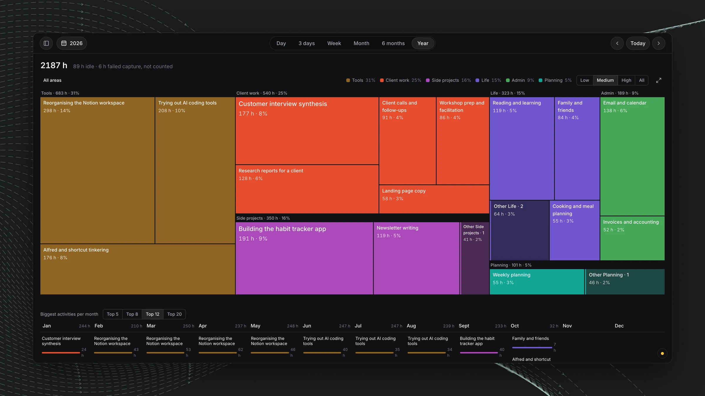
It’s an awesome visualization, and a beautiful way to see all the ways we fail to manage our time here on Earth. It’s our most precious resource, you know.
How it took shape
With AI, designing is now a joy. Well, not a joy, but it’s super speedy. I got Opus 5.5 to generate mockups of ideal implementations, and eventually we got to a shape where the only real thing you’re changing in the app is the time range. So you can watch your data on a day, week, month or year basis.
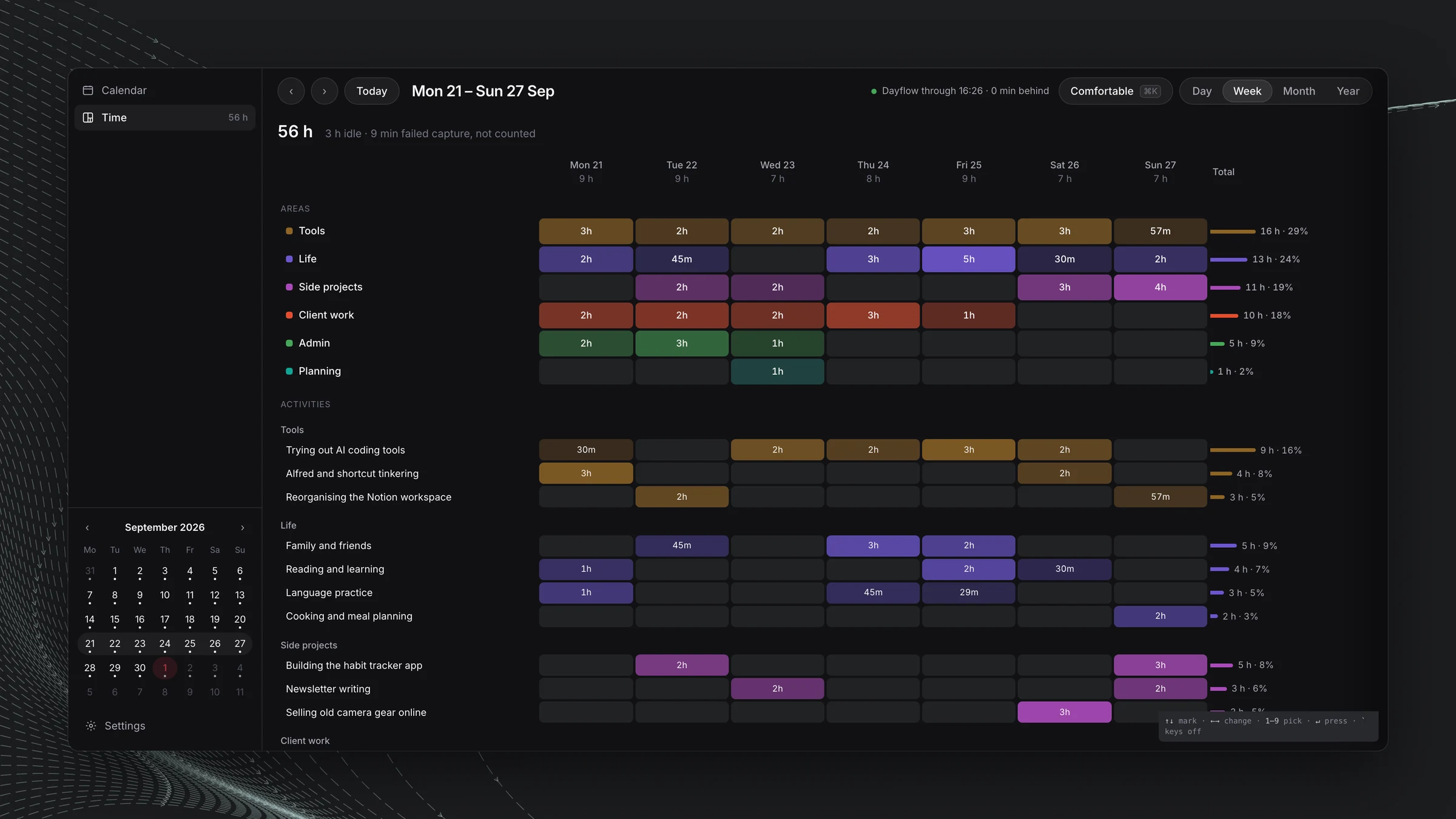
We tried a matrix view. We tried mini treemaps.
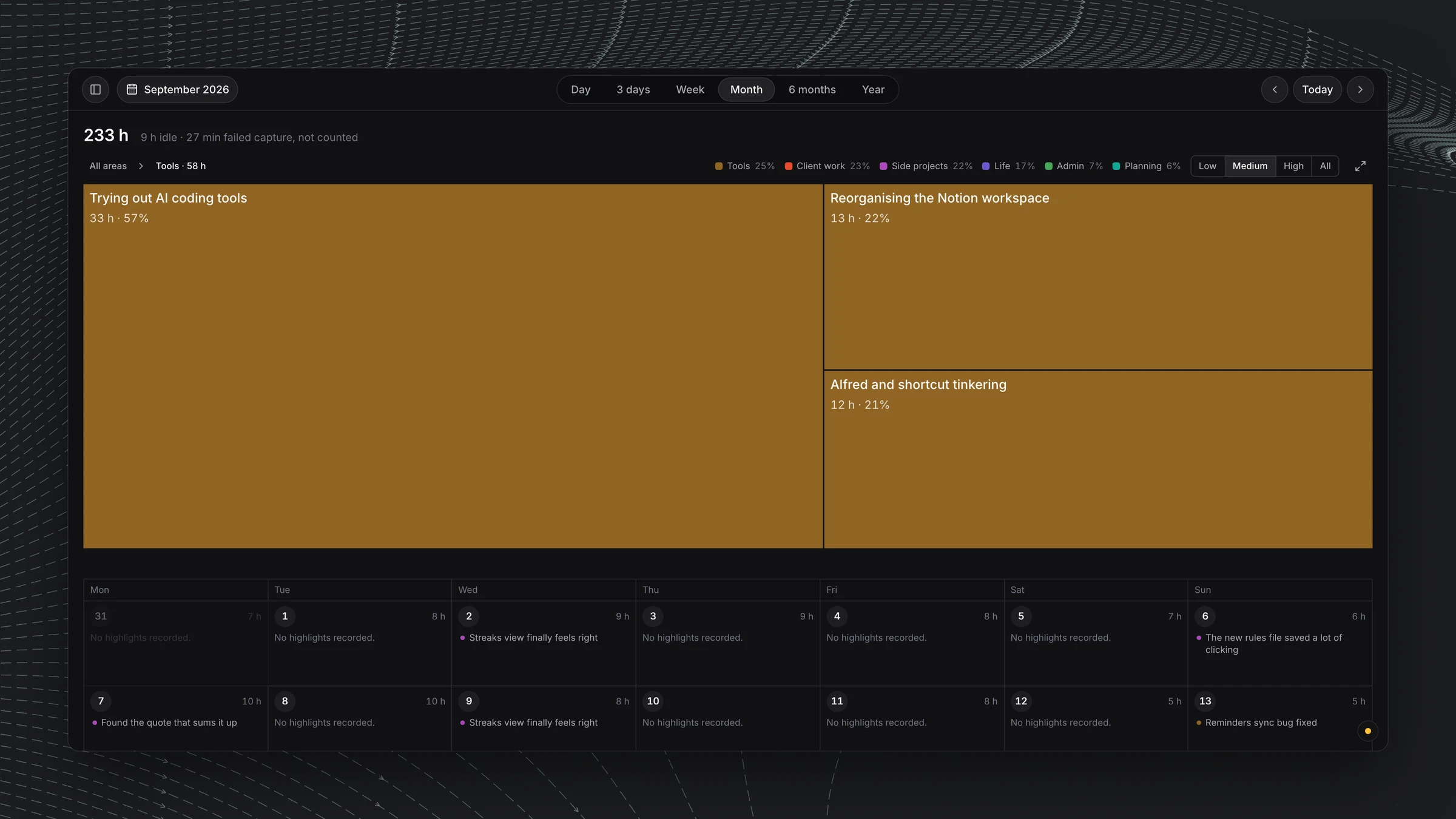
But the beauty of the larger treemaps is that you can full screen them.
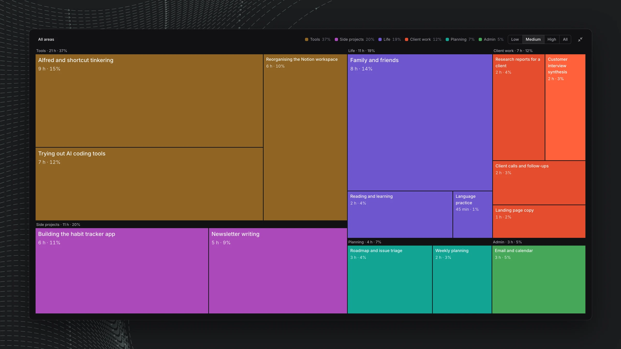
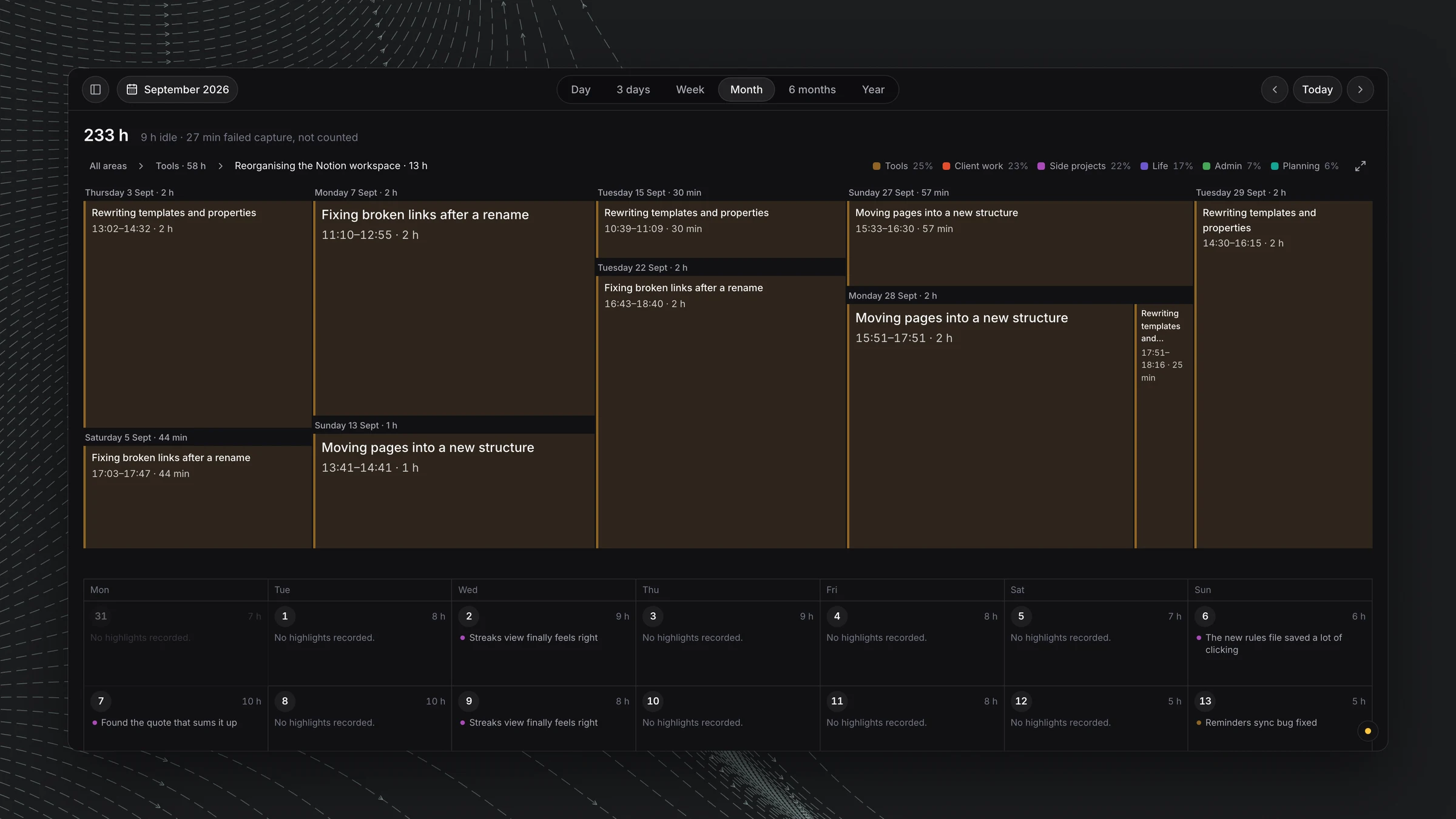
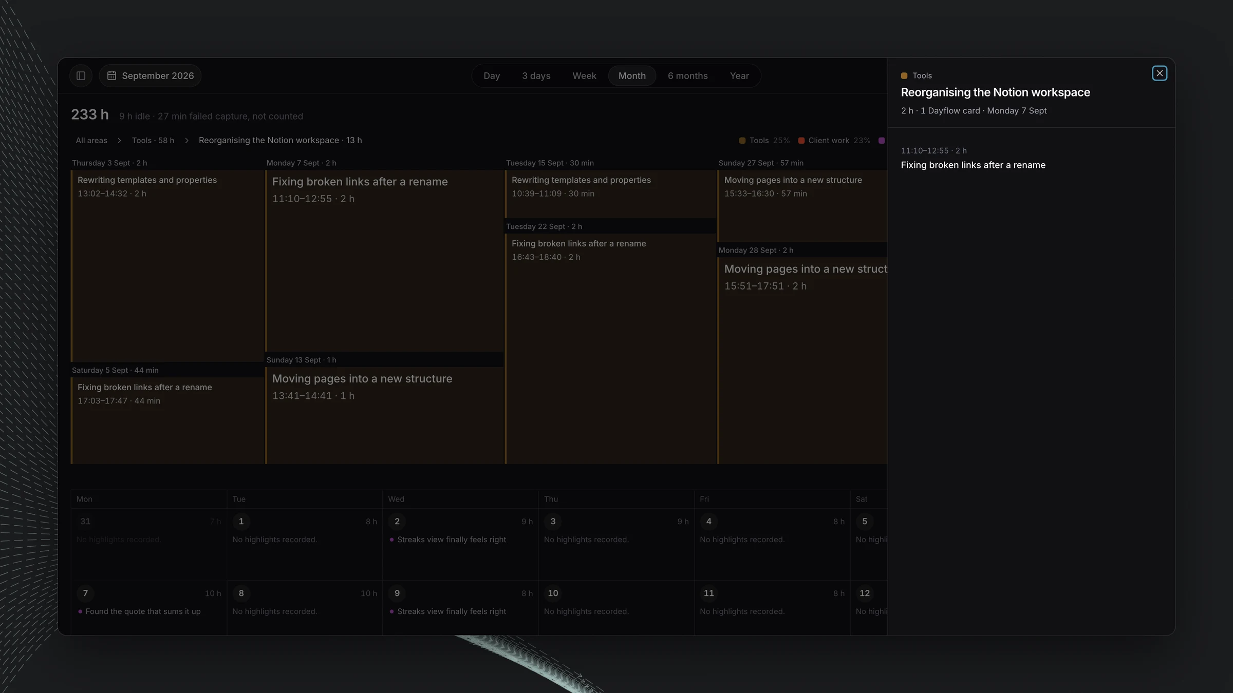
And then you dig into an individual block, continuously zooming in on what that block is. Click an area and it opens into its activities. Click an activity and you get the individual Dayflow cards behind it. Open a card to read what was recorded.
Where the data comes from, and what is still open
I haven’t fixed the data at the source. Dayflow records the time and writes the original highlights. A separate sorting step runs about every 30 minutes, gives each card an activity and an area, and makes short versions of the highlights. My app reads the results from its own synced store. The minutes always come from Dayflow. Idle time and failed captures are shown but not counted. A card with several things in it gets one main activity, so a big rectangle is a good overview, not proof that every minute inside it was spent on one task. I removed a Work and Personal split because I didn’t trust the signal yet, and anything not sorted stays visibly unsorted.
It’s an experiment, and it’s unfinished. The year view is still taking shape, and I still haven’t fixed the data at the source. But it already shows me things I didn’t expect, and I need to reconsider my priorities.